Designing Kanchey - How the idea was fleshed out
This post is part of a series on the complete creation process of Kanchey. In this post, we look into the design aspect of it. In the last post, we read about creation of the initial concept.
From the very beginning, it was obvious that control schemes such as mouse, joypads etc. were not ideal for a game like Kanchey. It needed a more tactile feel to it. As such, I decided to go with a touchscreen based approach. The most common platform for touchscreen games is mobiles. Thus, Kanchey now became a game for handheld devices.
In addition, most control schemes for such games involved setting a pointer in a direction, along with having a shot power bar which would allow a user to accurately set the direction and intensity of the shot. However, it felt less organic to me. This was used due to limitations of the input devices, which did not apply in case of touch screens. As such, I went with a touch based approach where both the direction and intensity of the shot would be decided by the flick of the user. This, of course, carried a new set of challenges mostly centred around how to make a user more comfortable with such a control scheme. I'll elaborate further on it in a later post (that'll be centred on user feedback).
The plan for the game was -
- Have a minimum viable product at the start of it. If there are sufficient resources later on, then the game can be expanded upon.
- Make everything as generic as possible. This makes sure that later modules can re-use a lot of the code.
- Take user feedback along the way to define what the game is.
- Make the game intuitive
Levels of completeness of product -
The idea was to have levels of completeness -
- The most basic level has-
- A single player mode, which acts like a puzzle
- Simple customization of player marble appearance (changing pattern inside marble)
- A fixed set of levels, through which one progresses, eventually coming to the end
- The next iteration has, in addition to the previous -
- greater customization of the marble (ability to choose colours) and greater polish in marble appearance (shadow, shine)
- Tutorials for initial levels (a hand that indicates the motion required to complete the level)
- A better level selection screen - original plan did not have level select, or was a simple text list. New level selection has photos of the level that unlocks as the player progresses
- The final iteration has, in addition to the previous-
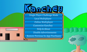
- A single player mode
- a local multiplayer mode and
- an online multiplayer mode. An online multiplayer can be considered to be the most ambitious component.
You may note that the final iteration primarily focuses on multiplayer. The gaming logic for local multiplayer and online multiplayer is practically the same, except the part that deals with handling online portions. This would present a new set of challenges,
